This will be a post about the first Power BI semantic model I created.
This will describe a semantic model that shows Point of Sale transactional data, in the lens of ability to create reports looking at digital sales, and the components that make up digital sales.
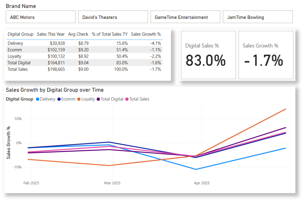
Our requirements were to be able to build a report that shows sales, growth and percent of total sales, by brand and by different components of digital (third party delivery, loyalty and ecommerce).
The components of digital was a complicating factor, as the business definition makes them non-additive. Loyalty sales contribute to digital, as do sales made through e-commerce channels. But some e-commerce sales are also loyalty, so we can’t add loyalty + ecommerce to get total digital.
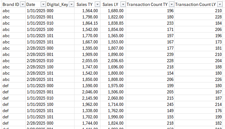
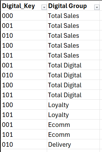
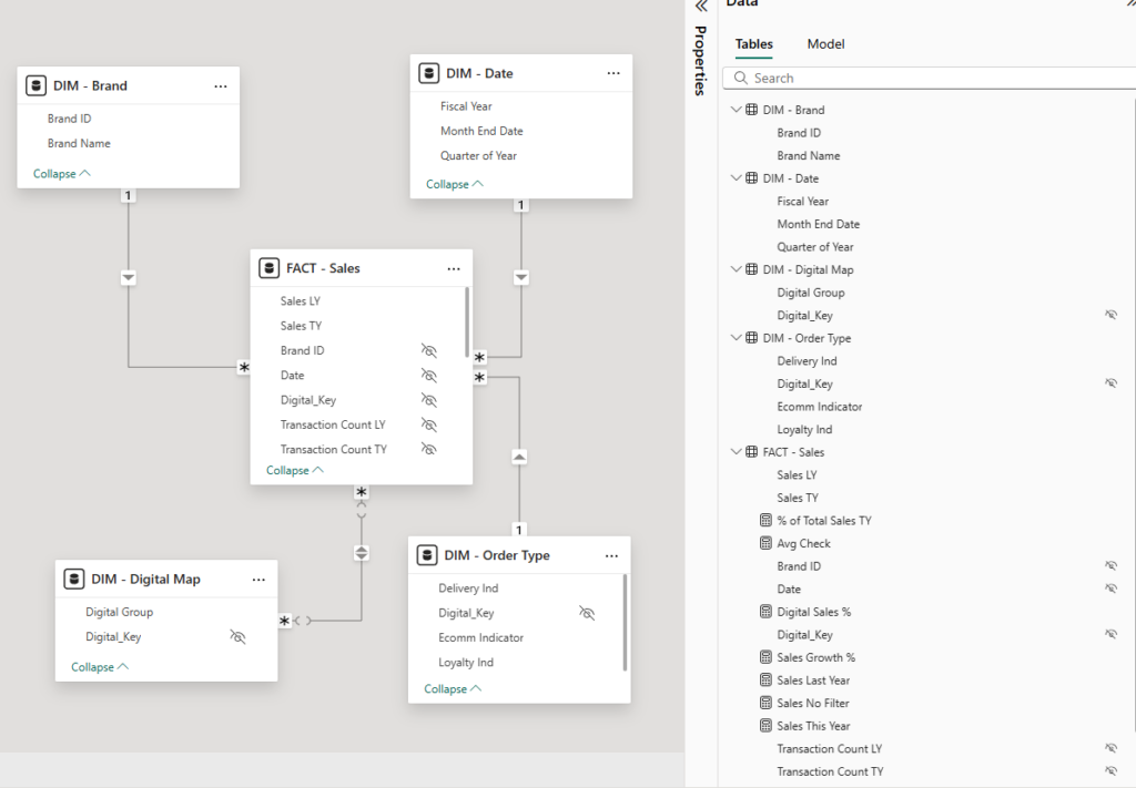
We created a fact table, at the required level of granularity, and added a surrogate ‘digital key’ in the fact table to set the grain at the combination of delivery-loyalty-ecomm; we used a dimensional mapping table with a many-to-many relationship to our fact table, allowing users to select a single digital grouping to look at.
Examples below showcase this using a very simplified sample set.
Fact table sample:

Order Type Dimension:

A digital mapping table was created, mapping digital key to their corresponding digital group. Each Digital Key value appears as many times as needed, for each applicable group.

The final model appears as follows

(The real model layered in more complex topics such as daypart, a more detailed order type dimension and the specific store sales happened at). Additionally, formal comparable sales logic beyond “this year vs last year” was applied, to ensure that sales growth was comparing same store sales year over year).
Thus, reports such as the following could be created:

EDIT: I realize that simplified model used in this post, it’s possible that the digital group might be able to be solved using Power BI calculation groups; however, our real life example was more complicated, and calculations groups would not have worked.
